

One look, every platform
Design
May 2026
4 min read
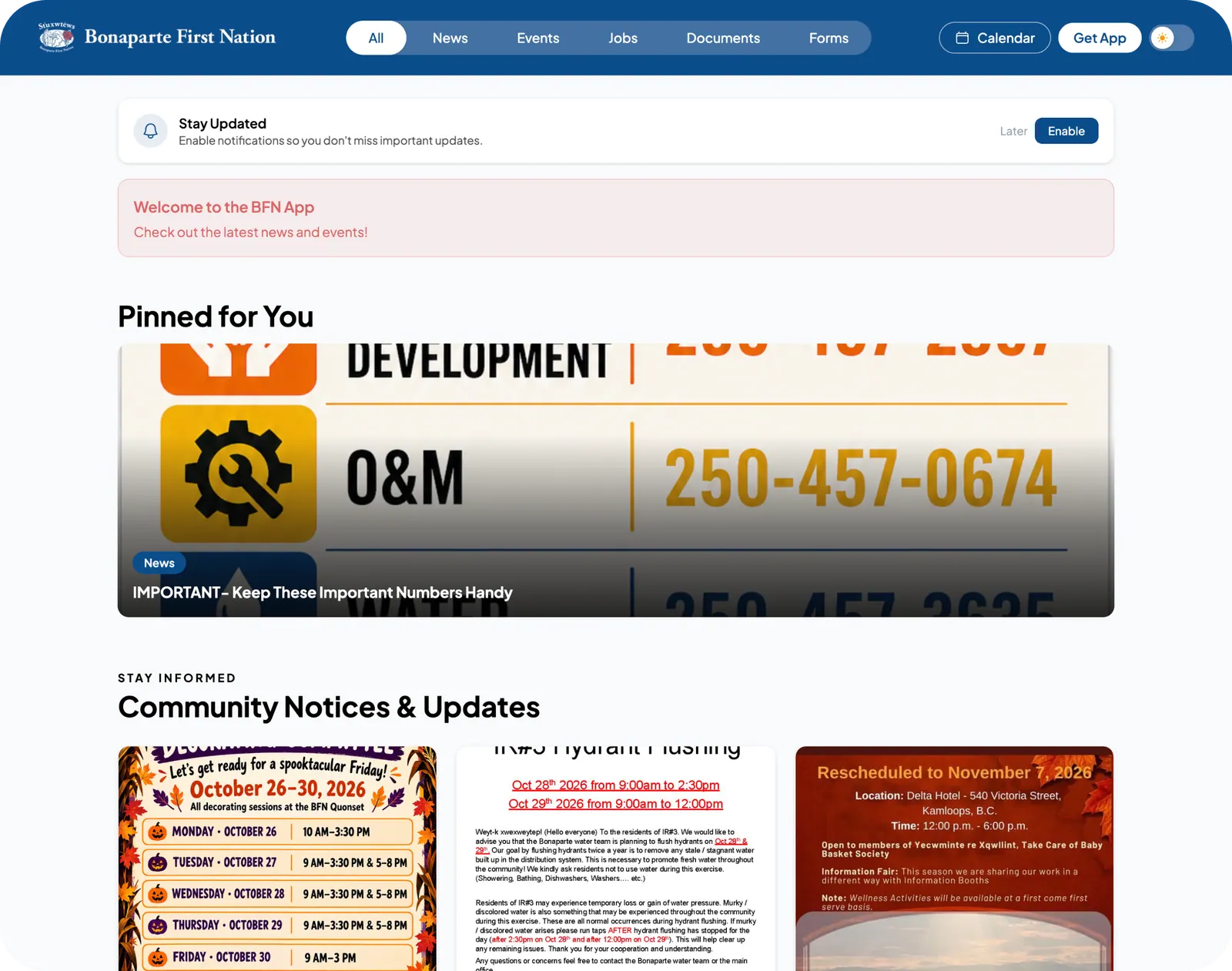
The Phase 2 visual refresh brought the mobile app, admin portal and member website into one visual language. The way everything worked stayed the same.
Why we refreshed it
Over time, the app, portal and website had drifted apart. Members shouldn't feel they've left the app when they open the website, so all three were given the same shapes, type and icons.
What changed
Plus Jakarta Sans across all three surfaces
Lucide outline icons at a single stroke weight
Softer corners on cards, full capsules on pills
What did not
Navigation, publishing flows and member-facing structure were left untouched. Nobody had to relearn where anything lived.
Want this in your community?
Thirty minutes, a real person, and a look at your own feed inside the platform.